Concept
How well do we actually know our immediate natural surroundings? Often, we can't even precisely name the plants that grow in it. Yet many of them even hold unexpected potential for creative use.
kiez_colours draws the attention to the dyes contained in plants and their possible applications. Plant dyes have a very special aesthetic. Since they are never chemically pure, they harmonize with each other in an amazing way and develop a certain sensuality and warmth.
Experimenting with plant dyes always leads to surprising results and requires an intensive study of the plants and the manufacturing
processes. The precise observation of nature that goes along with this enhances the awareness of seasonal and regional differences. The process of collecting and processing the plants becomes part of the creative process and influences it significantly. It becomes an act of improvisation and learning from the possibilities of nature. The focus here is on exploration rather than outcome. To facilitate the introduction to working with dye plants, the project website provides various instructions on how to make pigments and paints and how to dye textiles. An overview of local dye plants complements the instructions. The results of the user's own experiments can in turn be uploaded to the website's open archive. In addition to the online format, workshops are held as part of the project, enabling personal exchange and inviting people to experiment together.
materialexperiments_dye plants
Kiez is a Berlin expression for district, neighborhood, quarter. For us – who both grew up in Berlin – it means even more than that, which is neighbourhood solidarity, a sense of home, and a deep rootedness with the immediate surroundings.
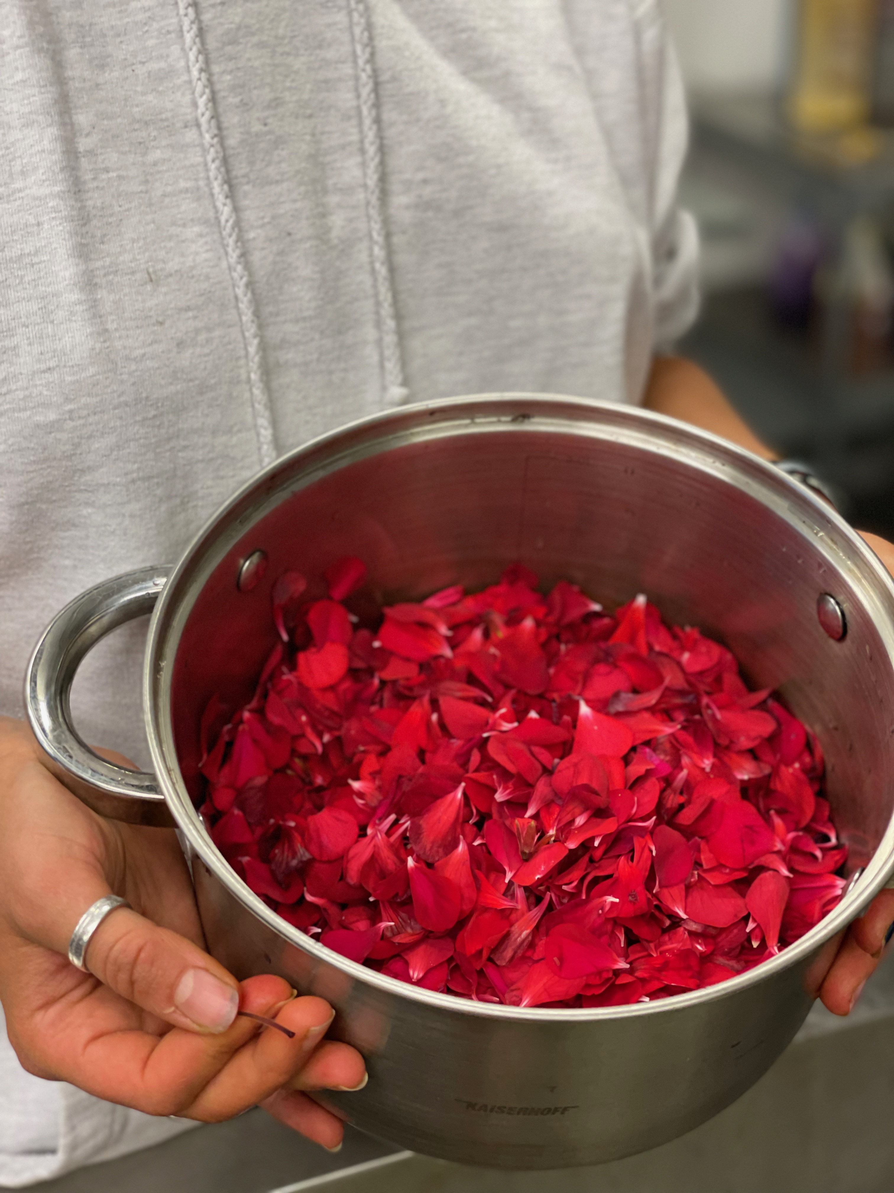
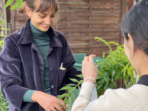
However, until now we had only paid superficial attention to the urban vegetation in our neighbourhoods. As part of our semester project, we started looking for sustainable forms of colour production. This drew our attention to the often inconspicuous plants along the way. On closer inspection we realized how many dye plants were among them. To limit the selection of plants for our project, we decided to determine our search radius to a defined location.
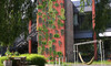
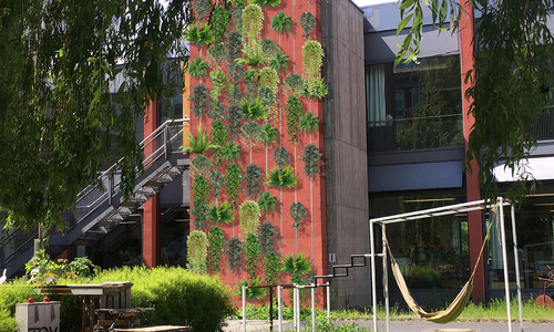
Due to the familiar atmosphere and the social connection at the weißensee kunsthochschule berlin, we as students have a strong emotional bond to our university. Therefore, it was a logical choice for us to use the university campus as a starting point for our search of dye plants.
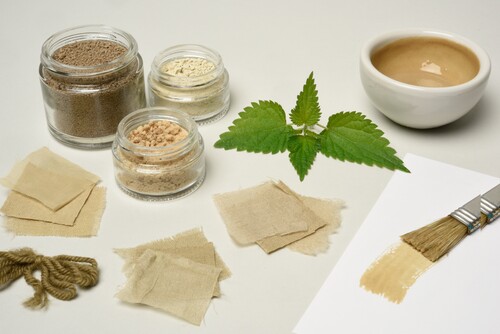
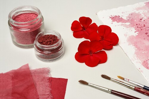
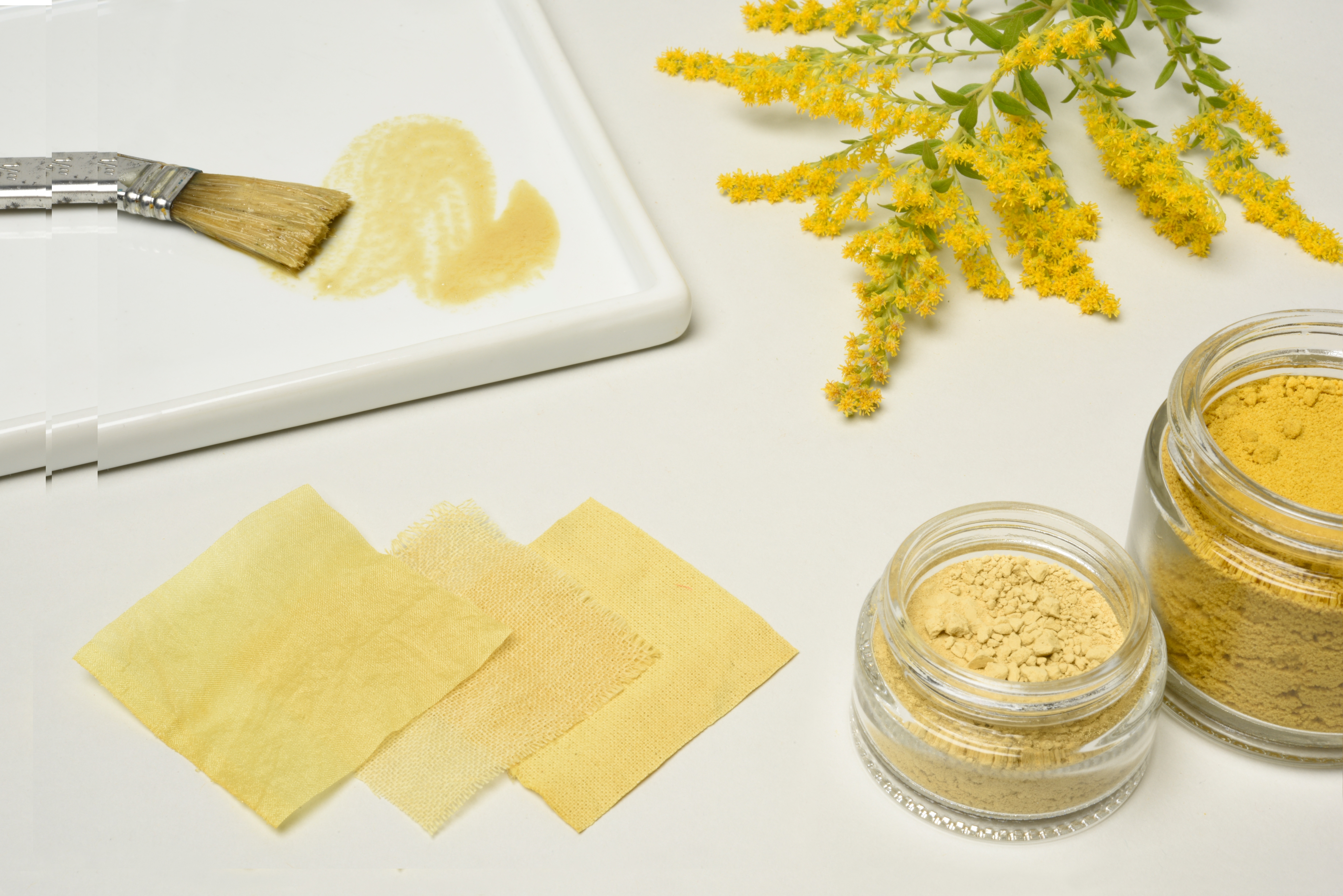
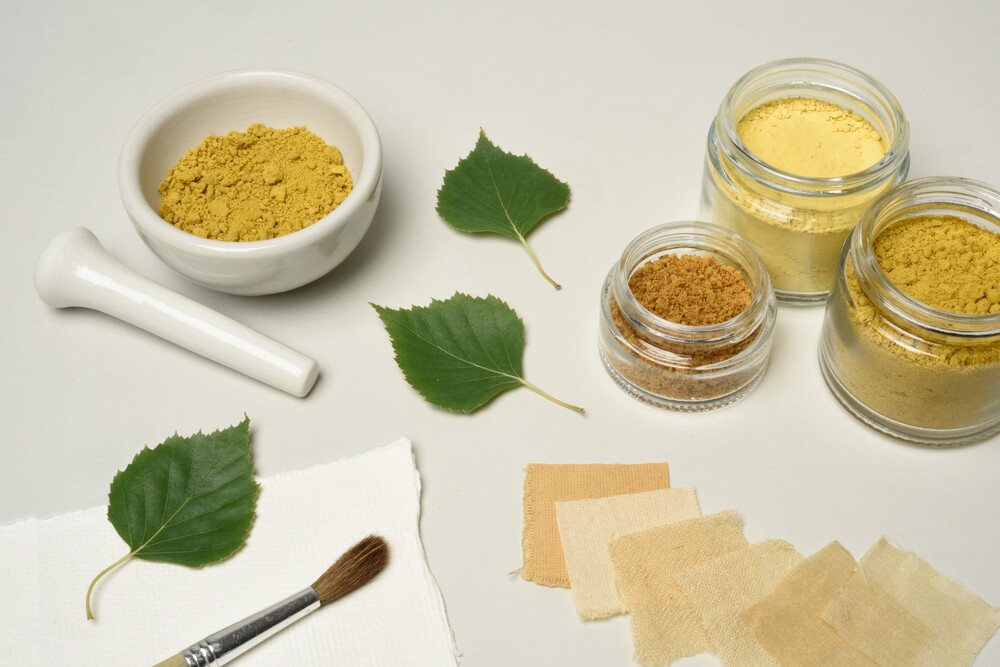
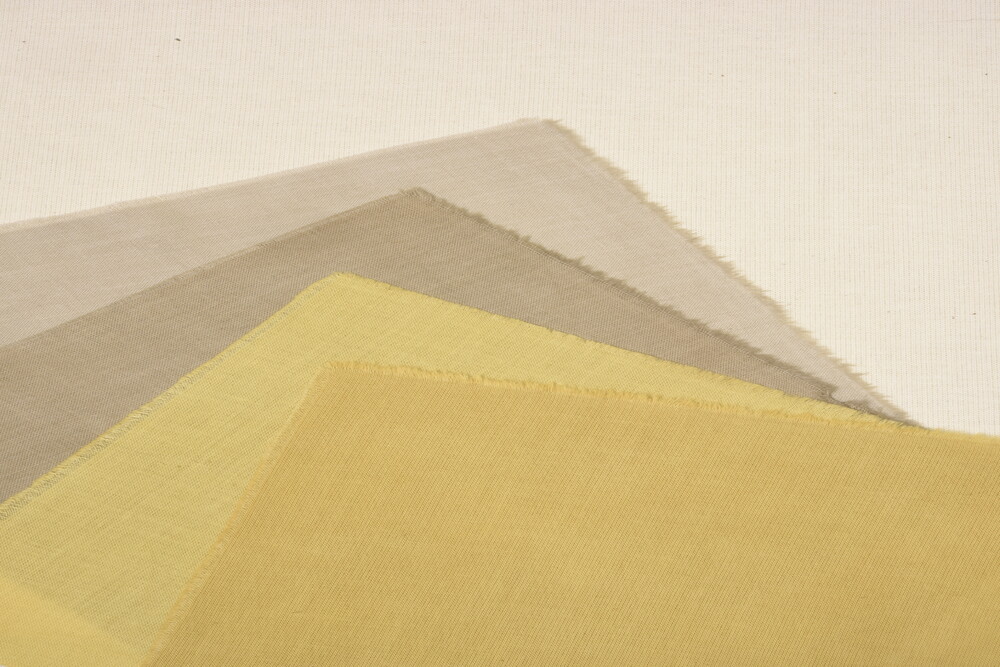
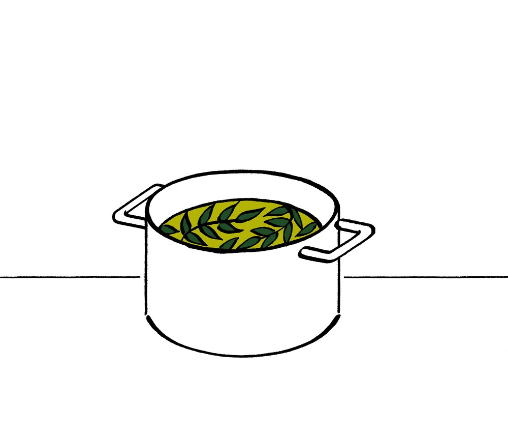
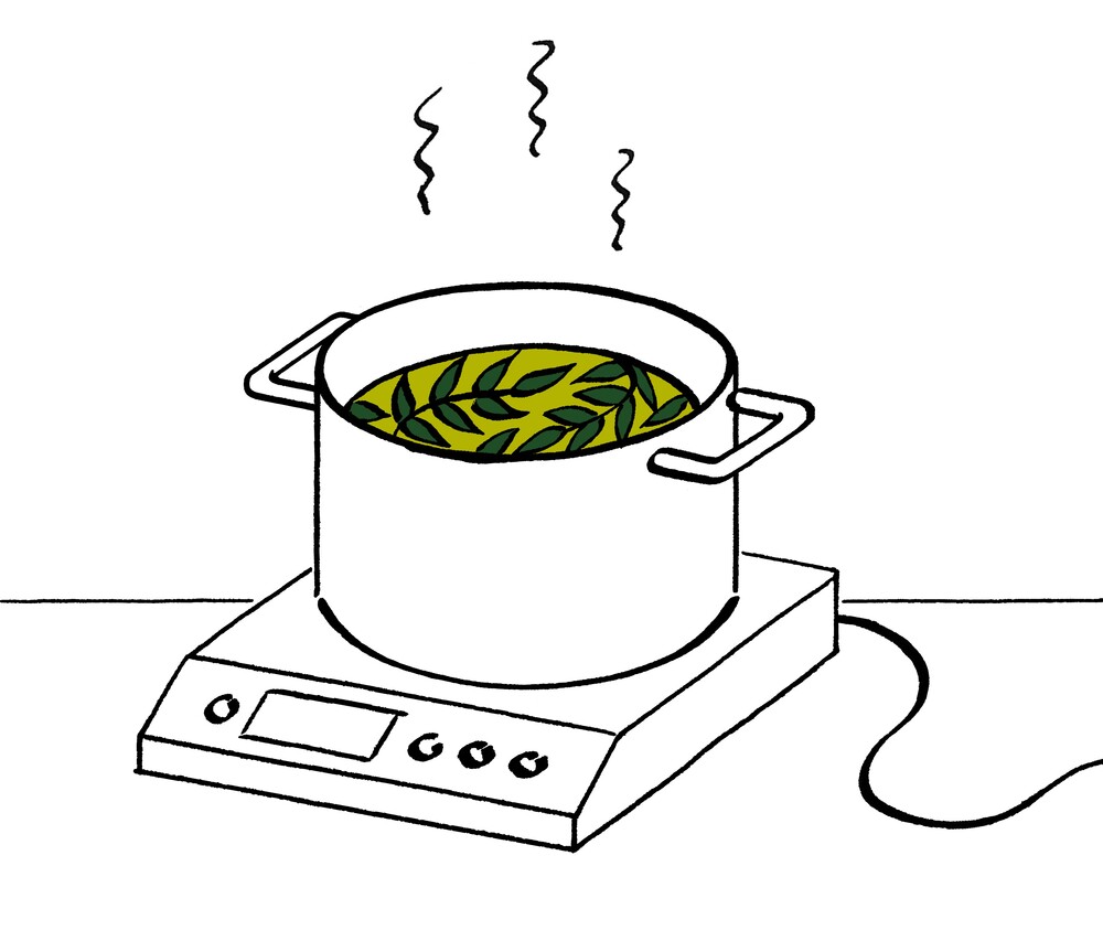
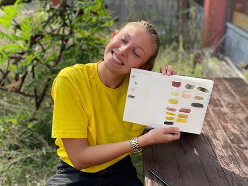
With the plants we found on campus, we made pigments and paints and dyed textiles.The photos on the following pages show the plants we used and give an impression of each possible colour palette. In the course of the project, we gradually expanded our radius and also went in search of dye plants in our home neighbourhoods.
material experiments _processes
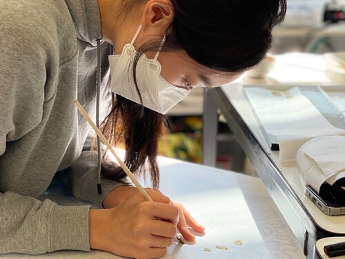
As a basis for our material experiments, we first collected recipes in books, blog entries and internet forums. Many of these recipes are very old and rely on centuries-old traditions. In each case, the publications only considered the dyeing of textiles or the production of pigments and painting materials. Rarely these three processes were brought in connection with each other, although there are many parallels and common characteristics.
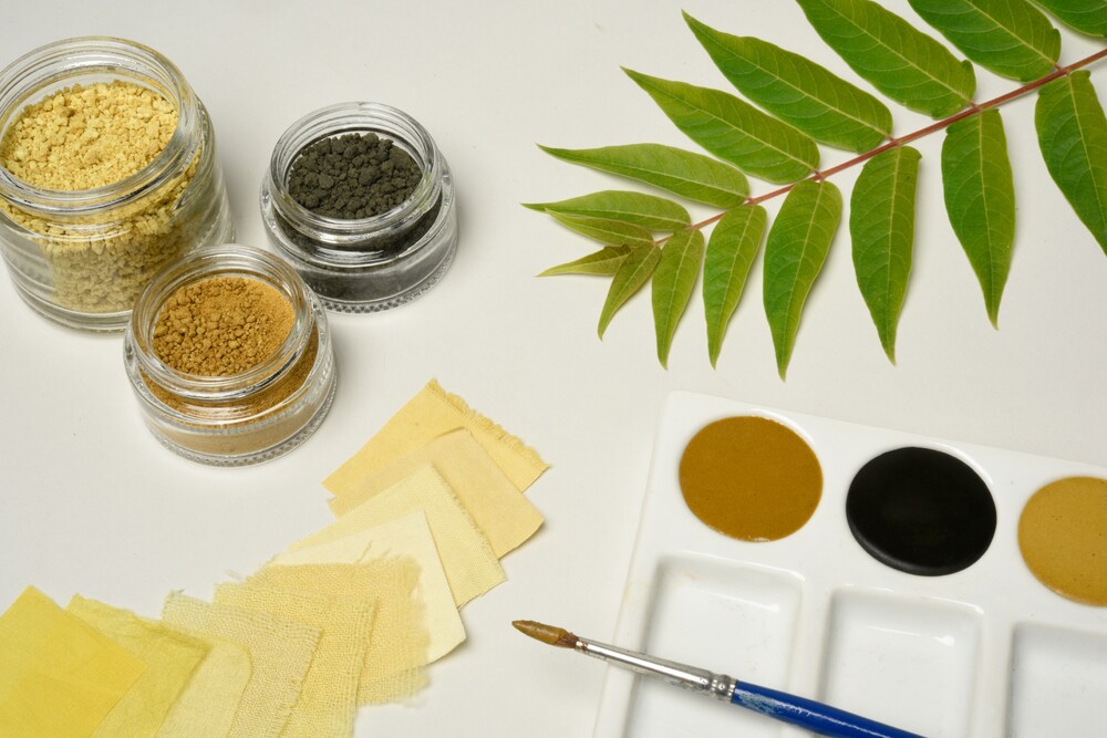
Plant dyes are very sensitive compared to chemical ones. Therefore, some care is needed during processing. For example, many plant dyes (especially reds and blues) react to changes in PH value. It is therefore advisable to use rainwater in the production of colour brews. This has a favorable PH value that does not affect the colour shade. However, this effect can also be used specifically to expand the colour spectrum. Care should also be taken with the utensils used for cooking. Raw iron and rust can greatly change the colours. Yellow tones change to greenish when iron is added. The green dye chlorophyll is not water-soluble and therefore unsuitable for the production of pigments and the dyeing of textiles. For this reason, the range of natural green shades is very limited. The colour-changing effect of iron can be used specifically here, e.g. by adding iron vitriol. Plant dyes are sensitive to light. Dyed fabrics should not be hung directly in the sun to dry, and pigments need to be stored in a protected place. We do not perceive fragility and transience as limiting, but as particularly charming and inspiring.
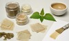
PIGMENTS
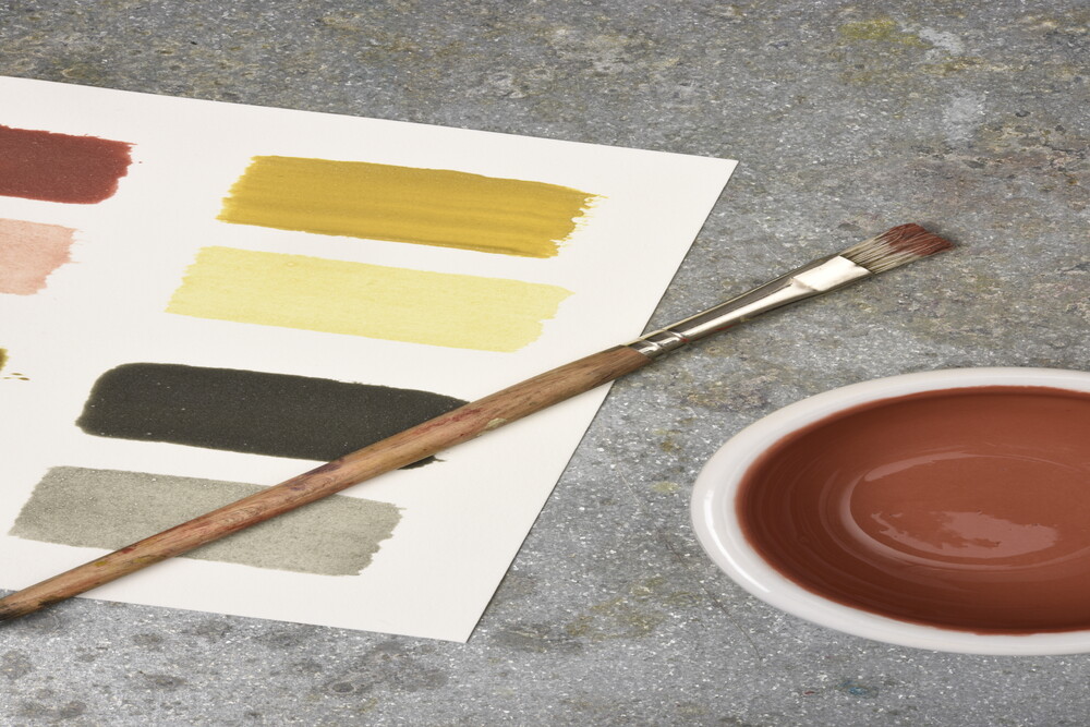
Just as with watercolours, a concentrated colour decoction can be used to paint directly on paper. For the production, flowers, leaves, barks and roots first have to be soaked and then boiled down with alum. Alum (potassium aluminum sulfate) is a bitter-smelling metal salt. It intensifies the colour and extends its durability.
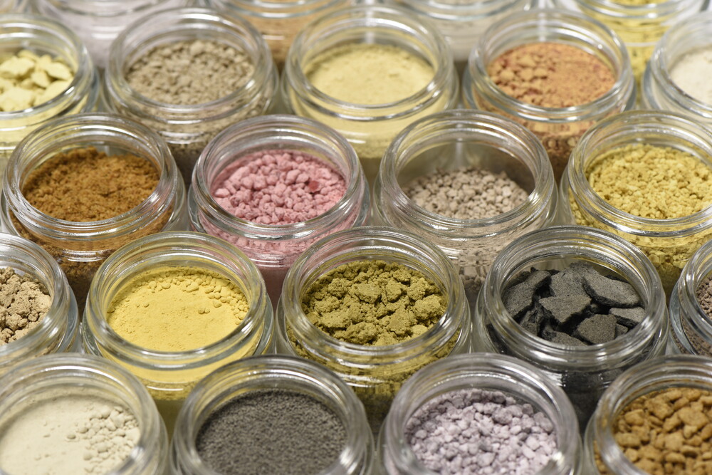
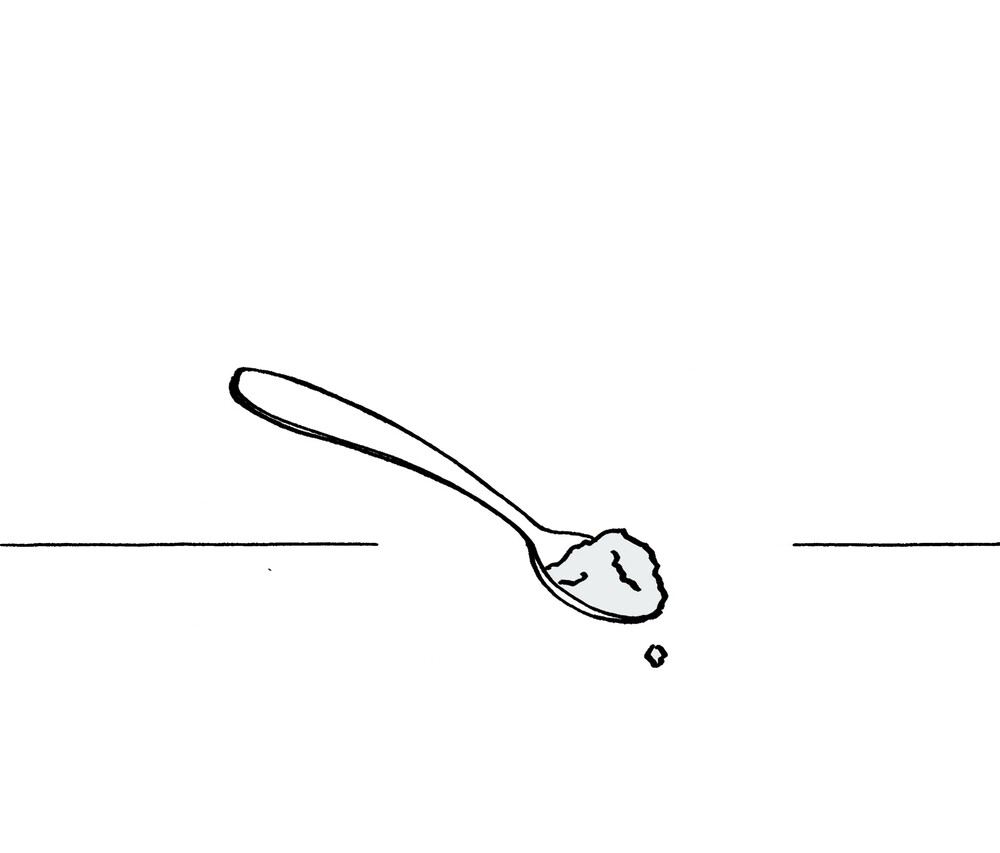
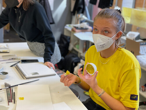
To make paints with more texture, you first need pigments. There are two different methods for their production. In the first, the colour brew is boiled down with a solid for many hours. After drying, the coloured solid can be ground into pigment in a mortar. Suitable solids are for example milk sugar, kaolin, alumina (aluminum hydroxide), silica, cellulose powder, gypsum and chalk. Each solid has its own special characteristics in processing (gypsum sets, chalk foams when stirred in). In addition, the solid influences the intensity of the colour and the texture of the pigments. Gypsum, chalk and kaolin break the colour and make it appear more pastel. Milk sugar and alumina, on the other hand, are transparent additives. Depending on the type of paint for which the pigments are intended to be used later, one or the other solid is recommended. In the second variant, a solution of water and soda (alternatively sodium bicarbonate or potash) is added to the colour decoction. During the following chemical reaction, fine alumina crystals are formed. In addition, carbon dioxide is released, causing it to foam strongly. This foam is then poured into a cloth and left to dry. This method produces a very fine, brilliant pigment. Compared to the first method, however, it is not as efficient, because after skimming off the foam, a lot of colourant remains in the liquid.
Due to the many different parameters, in many cases only estimated quantities can be given. In order to develop a comprehensive understanding of the parameters' interaction, we proceeded very systematically in our series of experiments. In each case, we applied the two different production methods and used different additives.
PAINTS
To ensure that the pigments adhere to each other and also to the painting ground, a suitable binder is required. There are two types of binder: aqueous binders such as vegetable gum, flour paste or casein, and non-aqueous binders such as oils, resins and waxes. Paints that have been mixed with an aqueous binder can later be thinned with water. Turpentine or oil can be used to thin paints with a non-aqueous binder. Tempera paints (lat.: temperare - English: to mix, to blend) are prepared with an emulsion, a mixture of aqueous and non-aqueous binders. Depending on the used binder, the texture, processing and colour effect of the paint differ greatly.
We conducted numerous tests with various types of paints, including gouache, rubber tempera, egg tempera, oil-wax paint, flour paste paint, and casein paint. Many of these fresh paints cannot be stored for long periods of time. For this reason, we then focused on the production of durable painting materials. Overall, this turned out to be more complicated than mixing fresh paints. It is a challenge and requires some experience to find the ideal formula for a watercolour paint that can be easily dissolved after drying, or for a wax or pastel crayon that leaves a rich colour coating on the paper.
On the following pages, we therefore explain our four favorite recipes for making fresh paints. These are much better for getting started. In addition to the binder, the painting ground also has a great influence on the appearance of the colour. For example, acid-bleached paper distorts the sensitive botanical colours. In our trials so far, cotton paper has proved to be particularly suitable.
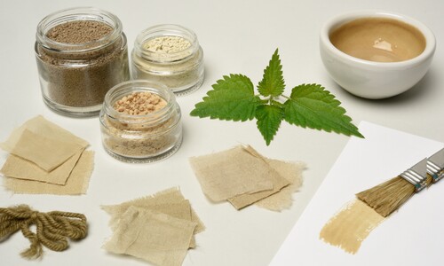
TEXTILES
For each dyeing plant, we applied the same system in terms of textile selection, pre-treatment, dye fleet and post-treatment. We used the three materials cotton, wool and silk respectively, as the dye absorption and effect is very different for plant and animal fibers.
Pretreatment is important to ensure that the textiles absorb the dyes optimally. One variant is to soak the textiles in cold black tea. Alternatively, the fabric can be treated with mordant. A combination of both methods is also possible, whereby the mordanting should take place in the second step.
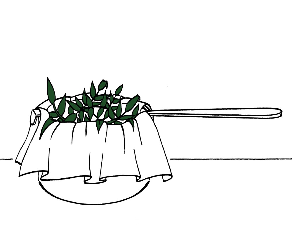
For the dye bath, it is recommended to use four times the amount of fresh plant material in relation to the dry fabric weight. For dried plants, a ratio of 1:1 is suitable. After soaking, the brew is heated and then strained. Animal fibers do not tolerate heat shocks, so it is important to allow the brew to cool completely down before adding the textiles. To ensure that the textiles absorb the dye evenly, they must be moistened and straightened beforehand. The fabrics should be sufficiently covered with water so that they can float well. Then the brew is heated again. After dyeing, the fabrics are hung to dry and washed clear after a few days. Subsequent fixing is not necessary when dyeing with natural dyes, but the pre-treatment is all the more important.
After dyeing, the achieved colour tone can still be varied by post-treatment in an acidic vinegar bath or a basic sodium bicarbonate bath. It makes sense to test the effect of the post-treatment in advance on small pieces of fabric. For this purpose, they are immersed in the PH bath for a few minutes and then dried. Testing dyes for their PH sensitivity is recommended especially when colour changes are not intended. So post-treatment can be used both to check colour stability and as a stylistic element.
knowledge transfer _website
Through our numerous experiments, we have internalized the various processing steps more and more. We have learned to control the individual parameters systematically and at the same time have become aware of ever new phenomena. We wanted to share our great fascination for working with dye plants with others. Therefore, we decided to develop a digital format but also to get into personal exchange with people in an analog way.
For the digital transfer of knowledge, we developed a website. This was meant to convey basic knowledge about the production of pigments and paints as well as the dyeing of textiles. At the same time, the website should provide a platform for exchange. A website offers us several advantages. It is accessible to everyone who is interested and can also be expanded at any time. In addition, with a website one is very free in the choice of the used media: videos, pictures, drawings and texts can be combined easily. We designed a responsive website and started with a version for mobile devices. In contrast to a computer, a cell phone is small and equipped for wind and weather. This makes it a useful companion when collecting plants and also in the kitchen.
For the design of our website prototype we used the interface design tool "figma". This allowed us to simulate a website visit with linked pages and interactive elements. The following images are screen shots of figma's presentation mode.
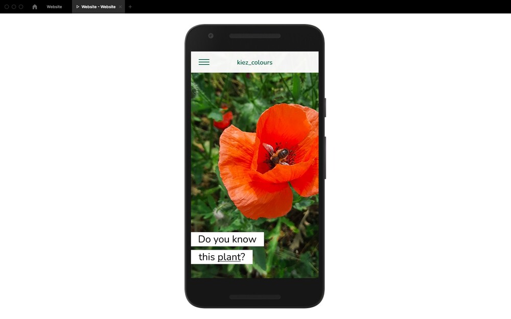
HOMEPAGE
The home page is intended to awaken the curiosity of visitors and draw their attention directly to dye plants and their creative uses. There are several versions of the homepage: when reloading, a new version appears, each presenting a dye plant and a product obtained from it (e.g. watercolour paint). In doing so, we would like to raise the visitors' awareness especially for the inconspicuous plants in their immediate surroundings.
DYE PLANTS
There are many dye plants in our surroundings and they are worth getting to know. This does not only mean knowing their name, but also where to find them and how to use them.
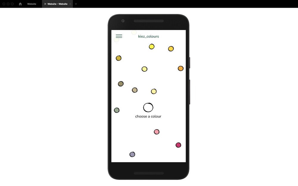
The kiez_colours website is primarily oriented towards art and design interested people. We assumed that their creative process would most likely start with a particular tone of colour, and only later would the question emerge as to which plants could create that tone of colour. Based on this thought, we decided to start the plant overview with a colour circle.
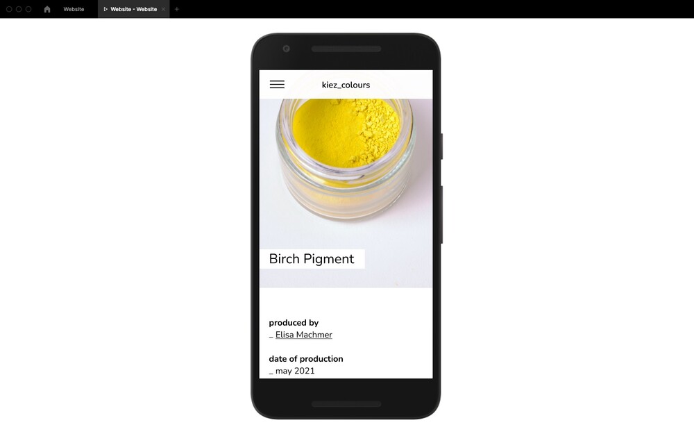
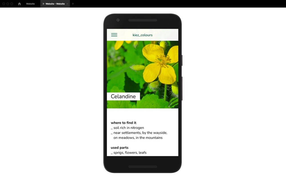
There are several coloured circles drawn in the diagram. By clicking on them, the name of the corresponding plant appears and another click leads to a more detailed page with information about the plant. On each plant page there is information about the location, the harvest time, the colouring plant parts and specific characteristics, such as medicinal benefit. At this point we remind the visitors to harvest with care. This means, to harvest gently and from several locations.
GUIDES TO BOTANICAL COLOURS
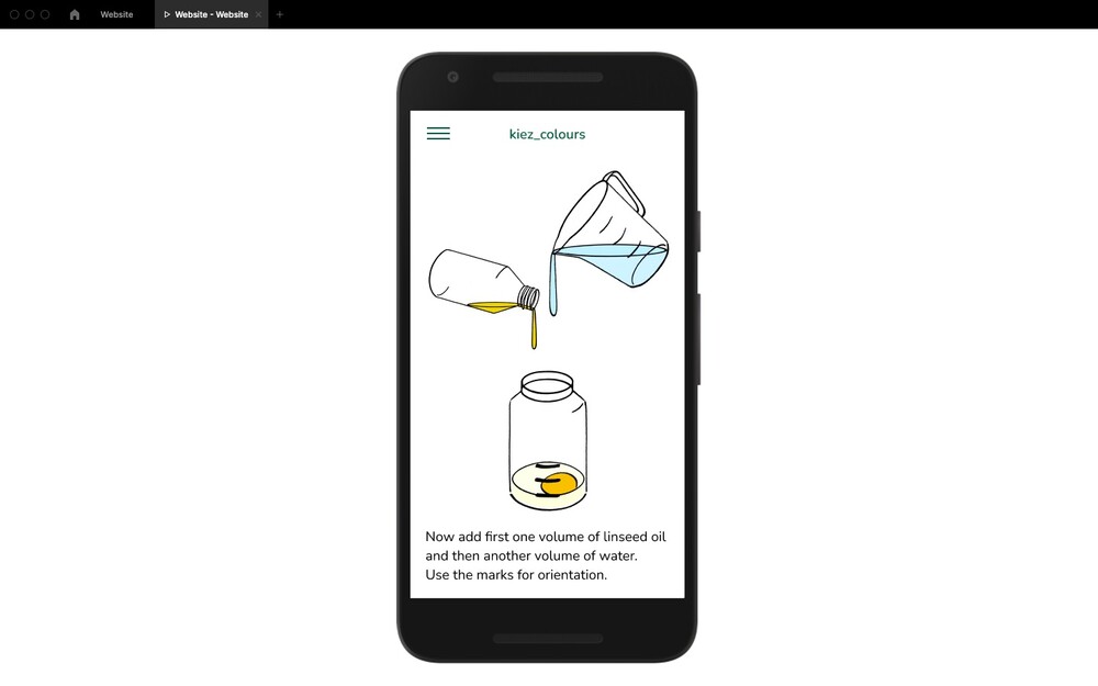
A main focus of the website is on the explanatory guides on how to extract botanical colourants for processing into pigments and paints, and for dyeing textiles. The guides describe the processes step by step and can either be used for basic orientation or directly as recipes.
They are split into three main chapters: plant to pigment, pigment to paint and colours on textiles and integrate the recipes used in the material experiment phase of the project. To illustrate the different steps, we created drawings that highlight the most important information. They are drawn with a cartridge pen on paper and later digitized and coloured. The loose drawing style reflects the playful character of the processes.
OPEN ARCHIVE
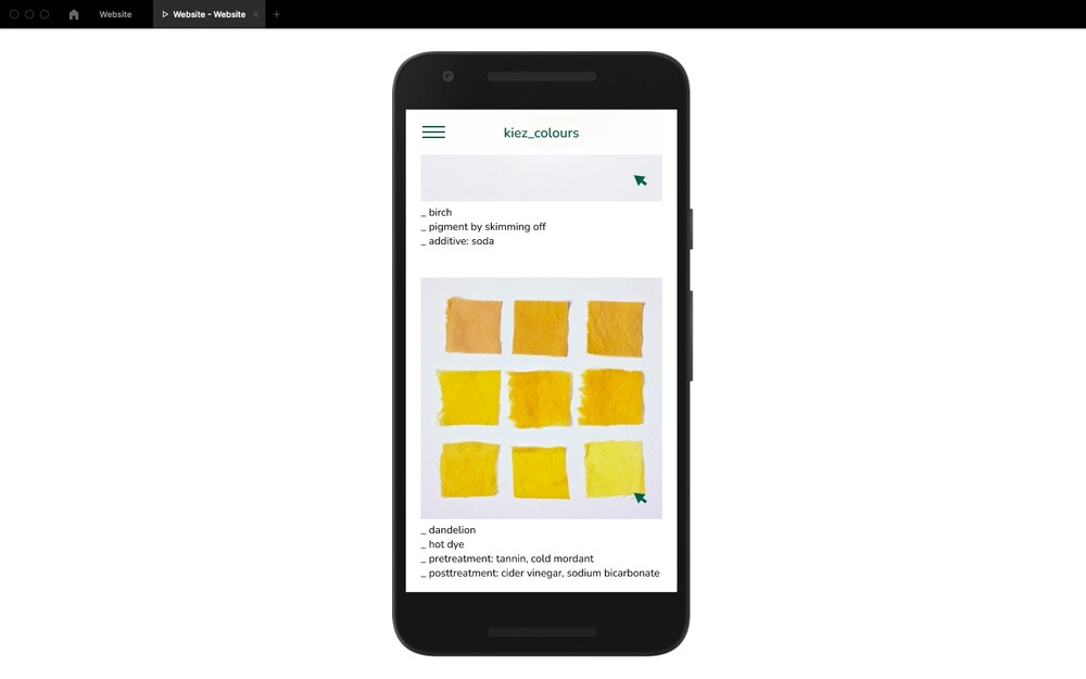
The open online archive offers visitors of the website the possibility to participate directly in the project and to share their own results of their experiments with the community. The archive could also integrate results created in workshops or other offline formats and could therefore be linked to the school's seminars. Over time, a large collection of recipes could evolve here.
On the first page of the open archive all uploaded recipes are listed with a picture and a short description. To keep track, the uploaded results can be filtered by plant, colour and process. By clicking on one of the pictures, further information appears.The recipes and images were entered by the users into an online template. The predefined template enables a systematic collection of data and thus helps to ensure a better overview.
WORKSHOPS
It is part of the concept of kiez_colours to combine offline and online formats such as a website and workshops. Information about upcoming workshops on botanical pigments and dyes can be found on the project's website. Registration is possible via the website. In addition, the website provides an overview of workshops that have already taken place.
More information about the workshops will be given in the next chapter knowledge transfer _workshops (p. 56).
PROTOTYPE RECORDING
The pictures of the website shown before are screenshots of the program's presentation mode and therefore little sneak peaks into our website design. Within the program figma there is the possibility to run your prototype and make the programmed interactions visible. This was a handy tool during the design process, but it also allows us to show our prototype to others.
If you wish to see more of our website, please scan the QR Code on the following page. It will bring you directly to the screen recording.
CONCLUSION
This project work was a first entry into web design for both of us and we are very grateful that we had the opportunity to deal with it so intensively within the greenlab project. We got along well with figma and experienced it as a very useful tool to quickly realise our visions. It was not only important for us to create a visually appealing design, but also to implement it as realistically as possible.
First, we familiarized ourselves with the basic principles of web design. The concept of responsive design, where the website automatically adapts to different screen formats, was new to us. We used the mobile-first strategy, which means that the design is first created for mobile devices and then adapted for larger screen formats.
While designing the website, we gave special thought to the implementation of the instruction pages. We considered for a long time which form of presentation would be most suitable for the processes - whether photos, videos, animations or drawings. In the end, we chose drawings because they allowed us to reduce the visualization to the essentials. Thanks to the playful drawing style, the instructions keep their lightness despite the great abstraction and convey joy.
We decided to leave the website in its current state. At the moment we do not have the time resources for a technical implementation and for the subsequent maintenance of the website. However, we could well imagine going back to our website concept at a later date and continuing to work on it.
knowledge transfer_workshop
After experimenting and working on the website for a long time as a team of two, we felt a great need to share our acquired knowledge and our great enthusiasm with others. A workshop offered the ideal setting for this.
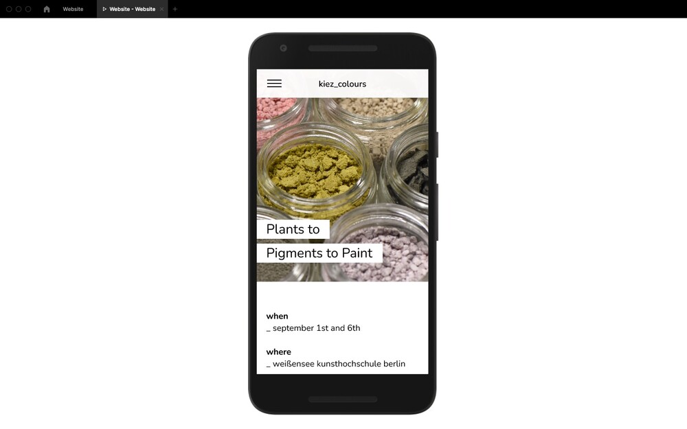
The first workshop we held was entitled "Plants to Pigments to Paint". Since the complete process takes some time and the pigments have to dry for a few days in between, we split the workshop into two days.The first part "Plants to Pigments" took place on September 1, the second part "Pigments to Paint" on September 6. We were kindly allowed to use the university dye lab for the workshop. Our target group for this workshop were the students of the university. On the one hand, we suspected some interested people among them, on the other hand, external persons were not allowed to enter the university campus due to the pandemic.We distributed the invitation for the workshop via Incom, our platform for internal university communication, as well as via private contacts among the students. The overall feedback on the workshop offer was very positive and nine students registered. Both workshop days were documented photographically by Till Scharmann, for which we asked the participants' permission in advance.
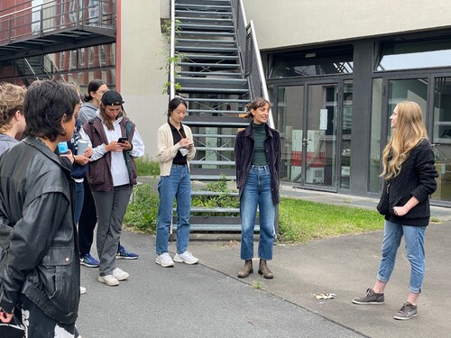

On the first day of our workshop, we met in the morning in the dyeing lab. After the first get-together, we started our tour around the campus, where we made the participants aware of the different dyeing plants growing there. We also visited the allotment garden belonging to the university. After the exploration tour, we reviewed our discoveries and afterwards we asked the participants to collect different dye plants in teams of two or three. To expand the colour palette a bit more, we had additionally brought some other dried and fresh plants. After the plants were chopped up and cleaned of dust and dirt, they were soaked and boiled. After straining, the colour brews were poured into canning jars for boiling down. We had asked the participants in advance to take some such jars with them.We both took on the task of boiling down the colour brews. We thus spent two whole days in the dyeing lab.
On the second day of the workshop, the pigments had dried. Arranged on plates, they were spread out on the large table in the middle of the room. For a start, we asked the participants to guess which pigment belonged to which dye plant. They were very surprised by some of the results. After the little quiz, we now wanted to create paints from the pigments. We tried three different recipes with the participants: Egg tempera, gouache and flour paste paint. We consciously chose simple recipes and also preferred aqueous binders because they would dry faster. We had also made sure that only one of them included animal products, to be considerate of vegan participants. Everyone was eager to fill their notebooks and drawing pads with colour samples. While doing so, we compared the different properties of the paints, such as texture and colour intensity. The mortars were constantly passed back and forth. Thanks to the good weather, we were able to sit outside while painting. At the end of the second day, the participants were allowed to help themselves to the leftover pigments and take them home.
Conclusion
The participants engaged in both workshop days with great enthusiasm and dedication. You could clearly feel how excited everyone was about working together as a group after the long months of isolation due to the pandemic. The students were from a wide variety of disciplines and semesters. Some of them had already gained their first experiences in working with dye plants, while others were well versed in mixing paints. Because of the diverse previous experiences, we were all able to learn a lot from each other. Meanwhile, making pigments was a new experience for all of our participants. The workshop offered them a gentle yet intensive introduction to the subject.
Based on the very good feedback and our own positive experience, we can both well imagine giving further workshops in the future. However, we would then have to think about the financing and either find a sponsor or charge a participant fee.
If we would repeat our first workshop, we could optimize the process by making a few small changes. For example, next time we would already start collecting the dye plants during our campus tour. It took a lot of time to collect the plants in groups, so we needed to hurry a bit towards the end. If there was a longer time gap between the first and second day of the workshop, the pigments would have more time to dry and we would not need to boil them down as long.
Dyeing textiles would also be an interesting topic for another workshop. We also believe that an expansion of the target group could be an enrichment for everyone involved. For example, a workshop with students and neighbours of the university could be a nice way for a soft approach. Another idea is to develop a workshop series in which workshops are held at different locations within the same time period or, alternatively, always at the same location but at different times of the year. In this way, regional and seasonal differences in the plant colour palette could be systematically explored.
outlook
Through our project kiez_colours, we have learned a lot of new things and acquired diverse experiences. During the intensive examination of the plant dyes and the various manufacturing processes, we became aware of the complex interaction of the different parameters. Exploring this systematically, and thus making results repeatable, increased our awareness of the principles of scientific work. By working on the website prototype, we also became familiar with the basics of web design. In addition, our numerous photo shoots allowed us to expand our knowledge of light setup, camera settings, and image composition. Until our final presentation in July, our focus was mainly on the individual material experiments and the design of the website. During the lecture-free period, we concentrated more on the workshops and the documentation of the project.
Our awareness and appreciation of the variety of urban vegetation increased continuously throughout the project. While searching for dye plants, we soon realized that it does not necessarily require a dye garden to obtain a diverse colour palette. With luck and an attentive eye, many intense colours can be found right outside the front door. In addition, the selection of colours can be expanded considerably through the specific manipulation of the processing of the dye plants. Collecting and processing thus become an integral part of the creative process.
Although we have dived deep into the subject through our numerous experiments, we still have the feeling that we are moving on the surface. There is still much to discover and we want to keep going on.